Monday, October 21, 2013
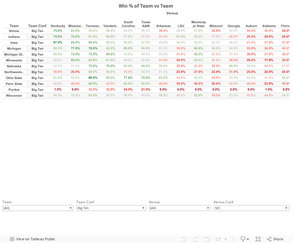
HuskerMath's FBS Power Ranking Win Percentage Matrix
Use the filters at the bottom to make the matrix a bit easier to handle, as well as easier to load.
Friday, April 12, 2013
Which Teams Overachieved and Which Teams Underachieved in 2012?
Tonight, while working putting together the final validation of the 2013 FBS Prediction Model, my analysis of the results highlighted some very interesting, and kind of disconcerting, things about Nebraska's 2012 season.
The model simulates every FBS game for the entire season.
As validation, I used the methodology to simulate the 2012 season and prepared a comparison between between the model results and the real game results.
This first chart shows some of those results of the predicted versus actual wins.
A positive number of the vertical axis means the model predicted more wins than a team achieved. Likewise, the negative numbers mean the model predicted fewer wins than the team achieved.

The average delta between the predicted win total and the actual win total is 1.15 games per team.
21% of teams were predicted correctly. 20% were under-predicted by one win, and 29% were over-predicted by one win. The model predicted more than 70% of seasons accurately to within one win.
The model under-predicted 12% of season by two wins and 5% by three wins. It over-predicted 7% over season by two wins and 6% of season by three wins.
Can you guess which team was the most over-achieving?
You betcha. Dear Old NU.
The model predicted 6.91 wins but the Huskers finished with 10 wins, for a delta of -3.09 wins.
While some may be inclined to see this as a positive, and it's certainly better than winning three fewer games than the model anticipated, the fact remains that Nebraska's scoring offense and scoring defense (the basis of the model) should have resulted in a 7-win season...not a 10-win season.
Remember the amazing streak of 4th quarter heroics in the Wisconsin, Northwestern, and Michigan State, and Penn State games? Remember how Denard Robinson left the game before halftime?
Sometimes, it's better to be lucky than good.
Interestingly, Ohio State is the #2 most overachieving team, with a predicted win total of 9.12. Had they played in the Big Ten Championship Game or a bowl game, they would almost certainly have been the most overachieving team by a large margin.
The Top-10 overachievers and Bottom-10 underachievers are:

So, can you guess which team had the largest standard deviation in the model results, and by proxy, was the least consistent and predictable?
Yup, Dear Old NU. Again.
Now, guess which team had the lowest standard deviation in model results.
Hint: they won the National Championship.
I'll let my readers draw their own conclusions about this one.
By the way, I'm now a writer over at Football Study Hall. Stop by and check it out. I'll be writing about more than just the Huskers over there.
GBR!
@HuskerMath
The model simulates every FBS game for the entire season.
As validation, I used the methodology to simulate the 2012 season and prepared a comparison between between the model results and the real game results.
This first chart shows some of those results of the predicted versus actual wins.
A positive number of the vertical axis means the model predicted more wins than a team achieved. Likewise, the negative numbers mean the model predicted fewer wins than the team achieved.

The average delta between the predicted win total and the actual win total is 1.15 games per team.
21% of teams were predicted correctly. 20% were under-predicted by one win, and 29% were over-predicted by one win. The model predicted more than 70% of seasons accurately to within one win.
The model under-predicted 12% of season by two wins and 5% by three wins. It over-predicted 7% over season by two wins and 6% of season by three wins.
Can you guess which team was the most over-achieving?
You betcha. Dear Old NU.
The model predicted 6.91 wins but the Huskers finished with 10 wins, for a delta of -3.09 wins.
While some may be inclined to see this as a positive, and it's certainly better than winning three fewer games than the model anticipated, the fact remains that Nebraska's scoring offense and scoring defense (the basis of the model) should have resulted in a 7-win season...not a 10-win season.
Remember the amazing streak of 4th quarter heroics in the Wisconsin, Northwestern, and Michigan State, and Penn State games? Remember how Denard Robinson left the game before halftime?
Sometimes, it's better to be lucky than good.
Interestingly, Ohio State is the #2 most overachieving team, with a predicted win total of 9.12. Had they played in the Big Ten Championship Game or a bowl game, they would almost certainly have been the most overachieving team by a large margin.
The Top-10 overachievers and Bottom-10 underachievers are:

I put a table with the full results of the model at the end of this post.
Finally, the model provides some insight into the consistency of a team's on-field performance. The standard deviation of the predicted wins can be used as a proxy for a team's consistency.
So, can you guess which team had the largest standard deviation in the model results, and by proxy, was the least consistent and predictable?
Yup, Dear Old NU. Again.
Now, guess which team had the lowest standard deviation in model results.
Hint: they won the National Championship.
I'll let my readers draw their own conclusions about this one.
By the way, I'm now a writer over at Football Study Hall. Stop by and check it out. I'll be writing about more than just the Huskers over there.
GBR!
@HuskerMath
| Rank | Team | Conf | Pred. Wins | Actual Wins | Delta (rnd) | Pred. Delta | Abs( Pred Delta) |
|---|---|---|---|---|---|---|---|
| 1 | Northern Illinois | MAC | 13.1 | 12 | 1 | 1.1 | 1.1 |
| 2 | Alabama | SEC | 12.7 | 13 | 0 | -0.3 | 0.3 |
| 3 | Florida State | ACC | 12.5 | 12 | 1 | 0.5 | 0.5 |
| 4 | Utah State | WAC | 11.2 | 11 | 0 | 0.2 | 0.2 |
| 5 | Oregon | Pac-12 | 11.0 | 12 | -1 | -1.0 | 1.0 |
| 6 | UCF | C-USA | 11.0 | 10 | 1 | 1.0 | 1.0 |
| 7 | Georgia | SEC | 10.9 | 12 | -1 | -1.1 | 1.1 |
| 8 | Boise State | MWC | 10.8 | 11 | 0 | -0.2 | 0.2 |
| 9 | Arizona State | Pac-12 | 10.7 | 8 | 3 | 2.7 | 2.7 |
| 10 | Cincinnati | Big East | 10.6 | 10 | 1 | 0.6 | 0.6 |
| 11 | Tulsa | C-USA | 10.5 | 11 | 0 | -0.5 | 0.5 |
| 12 | BYU | Ind | 10.5 | 8 | 2 | 2.5 | 2.5 |
| 13 | Texas A&M | SEC | 10.4 | 11 | -1 | -0.6 | 0.6 |
| 14 | Kansas State | Big 12 | 9.9 | 11 | -1 | -1.1 | 1.1 |
| 15 | North Carolina | ACC | 9.8 | 8 | 2 | 1.8 | 1.8 |
| 16 | Rutgers | Big East | 9.8 | 9 | 1 | 0.8 | 0.8 |
| 17 | Clemson | ACC | 9.8 | 11 | -1 | -1.2 | 1.2 |
| 18 | Oklahoma State | Big 12 | 9.8 | 8 | 2 | 1.8 | 1.8 |
| 19 | Bowling Green | MAC | 9.7 | 8 | 2 | 1.7 | 1.7 |
| 20 | Ohio | MAC | 9.7 | 9 | 1 | 0.7 | 0.7 |
| 21 | Vanderbilt | SEC | 9.7 | 9 | 1 | 0.7 | 0.7 |
| 22 | San Jose State | WAC | 9.6 | 11 | -1 | -1.4 | 1.4 |
| 23 | Fresno State | MWC | 9.6 | 9 | 1 | 0.6 | 0.6 |
| 24 | Stanford | Pac-12 | 9.6 | 12 | -2 | -2.4 | 2.4 |
| 25 | Kent State | MAC | 9.5 | 11 | -1 | -1.5 | 1.5 |
| 26 | Wisconsin | Big Ten | 9.4 | 8 | 1 | 1.4 | 1.4 |
| 27 | South Carolina | SEC | 9.2 | 11 | -2 | -1.8 | 1.8 |
| 28 | Notre Dame | Ind | 9.2 | 12 | -3 | -2.8 | 2.8 |
| 29 | Arkansas State | Sun Belt | 9.2 | 10 | -1 | -0.8 | 0.8 |
| 30 | Ohio State | Big Ten | 9.1 | 12 | -3 | -2.9 | 2.9 |
| 31 | San Diego State | MWC | 9.1 | 9 | 0 | 0.1 | 0.1 |
| 32 | Penn State | Big Ten | 8.8 | 8 | 1 | 0.8 | 0.8 |
| 33 | Florida | SEC | 8.7 | 11 | -2 | -2.3 | 2.3 |
| 34 | LSU | SEC | 8.7 | 10 | -1 | -1.3 | 1.3 |
| 35 | Oregon State | Pac-12 | 8.7 | 9 | 0 | -0.3 | 0.3 |
| 36 | Louisiana-Lafayette | Sun Belt | 8.6 | 9 | 0 | -0.4 | 0.4 |
| 37 | Northwestern | Big Ten | 8.6 | 10 | -1 | -1.4 | 1.4 |
| 38 | Oklahoma | Big 12 | 8.5 | 10 | -2 | -1.5 | 1.5 |
| 39 | Michigan | Big Ten | 8.3 | 8 | 0 | 0.3 | 0.3 |
| 40 | UCLA | Pac-12 | 8.2 | 9 | -1 | -0.8 | 0.8 |
| 41 | Louisiana-Monroe | Sun Belt | 8.2 | 8 | 0 | 0.2 | 0.2 |
| 42 | Pittsburgh | Big East | 8.1 | 6 | 2 | 2.1 | 2.1 |
| 43 | Western Kentucky | Sun Belt | 8.1 | 7 | 1 | 1.1 | 1.1 |
| 44 | Louisville | Big East | 8.1 | 11 | -3 | -2.9 | 2.9 |
| 45 | Mississippi State | SEC | 8.1 | 8 | 0 | 0.1 | 0.1 |
| 46 | Rice | C-USA | 7.9 | 7 | 1 | 0.9 | 0.9 |
| 47 | TCU | Big 12 | 7.8 | 7 | 1 | 0.8 | 0.8 |
| 48 | SMU | C-USA | 7.8 | 7 | 1 | 0.8 | 0.8 |
| 49 | Louisiana Tech | WAC | 7.7 | 9 | -1 | -1.3 | 1.3 |
| 50 | USC | Pac-12 | 7.7 | 7 | 1 | 0.7 | 0.7 |
| 51 | Nevada | MWC | 7.6 | 7 | 1 | 0.6 | 0.6 |
| 52 | Michigan State | Big Ten | 7.5 | 7 | 1 | 0.5 | 0.5 |
| 53 | Syracuse | Big East | 7.4 | 8 | -1 | -0.6 | 0.6 |
| 54 | North Carolina State | ACC | 7.4 | 7 | 0 | 0.4 | 0.4 |
| 55 | Toledo | MAC | 7.2 | 9 | -2 | -1.8 | 1.8 |
| 56 | East Carolina | C-USA | 7.2 | 8 | -1 | -0.8 | 0.8 |
| 57 | Navy | Ind | 7.2 | 8 | -1 | -0.8 | 0.8 |
| 58 | Air Force | MWC | 7.2 | 6 | 1 | 1.2 | 1.2 |
| 59 | Georgia Tech | ACC | 7.1 | 7 | 0 | 0.1 | 0.1 |
| 60 | Texas | Big 12 | 7.1 | 9 | -2 | -1.9 | 1.9 |
| 61 | Texas Tech | Big 12 | 7.0 | 8 | -1 | -1.0 | 1.0 |
| 62 | Nebraska | Big Ten | 6.9 | 10 | -3 | -3.1 | 3.1 |
| 63 | Western Michigan | MAC | 6.8 | 4 | 3 | 2.8 | 2.8 |
| 64 | UTSA | WAC | 6.6 | 8 | -1 | -1.4 | 1.4 |
| 65 | Central Michigan | MAC | 6.6 | 7 | 0 | -0.4 | 0.4 |
| 66 | New Mexico | MWC | 6.5 | 4 | 3 | 2.5 | 2.5 |
| 67 | Virginia Tech | ACC | 6.4 | 7 | -1 | -0.6 | 0.6 |
| 68 | Connecticut | Big East | 6.4 | 5 | 1 | 1.4 | 1.4 |
| 69 | Iowa State | Big 12 | 6.4 | 6 | 0 | 0.4 | 0.4 |
| 70 | Washington | Pac-12 | 6.3 | 7 | -1 | -0.7 | 0.7 |
| 71 | Middle Tennessee | Sun Belt | 6.3 | 8 | -2 | -1.7 | 1.7 |
| 72 | Ball State | MAC | 6.3 | 9 | -3 | -2.7 | 2.7 |
| 73 | Baylor | Big 12 | 6.2 | 8 | -2 | -1.8 | 1.8 |
| 74 | Mississippi | SEC | 6.2 | 7 | -1 | -0.8 | 0.8 |
| 75 | Minnesota | Big Ten | 6.2 | 6 | 0 | 0.2 | 0.2 |
| 76 | Troy | Sun Belt | 6.1 | 5 | 1 | 1.1 | 1.1 |
| 77 | Utah | Pac-12 | 6.1 | 5 | 1 | 1.1 | 1.1 |
| 78 | Memphis | C-USA | 5.9 | 4 | 2 | 1.9 | 1.9 |
| 79 | Iowa | Big Ten | 5.6 | 4 | 2 | 1.6 | 1.6 |
| 80 | Miami (Florida) | ACC | 5.4 | 7 | -2 | -1.6 | 1.6 |
| 81 | West Virginia | Big 12 | 5.3 | 7 | -2 | -1.7 | 1.7 |
| 82 | Purdue | Big Ten | 5.2 | 6 | -1 | -0.8 | 0.8 |
| 83 | Arizona | Pac-12 | 5.2 | 8 | -3 | -2.8 | 2.8 |
| 84 | Texas State | WAC | 5.1 | 4 | 1 | 1.1 | 1.1 |
| 85 | Houston | C-USA | 5.1 | 5 | 0 | 0.1 | 0.1 |
| 86 | Wyoming | MWC | 4.9 | 4 | 1 | 0.9 | 0.9 |
| 87 | South Alabama | Sun Belt | 4.8 | 2 | 3 | 2.8 | 2.8 |
| 88 | Marshall | C-USA | 4.8 | 5 | 0 | -0.2 | 0.2 |
| 89 | UNLV | MWC | 4.8 | 2 | 3 | 2.8 | 2.8 |
| 90 | Virginia | ACC | 4.8 | 4 | 1 | 0.8 | 0.8 |
| 91 | Maryland | ACC | 4.8 | 4 | 1 | 0.8 | 0.8 |
| 92 | North Texas | Sun Belt | 4.7 | 4 | 1 | 0.7 | 0.7 |
| 93 | Colorado State | MWC | 4.7 | 4 | 1 | 0.7 | 0.7 |
| 94 | Buffalo | MAC | 4.6 | 4 | 1 | 0.6 | 0.6 |
| 95 | Indiana | Big Ten | 4.5 | 4 | 0 | 0.5 | 0.5 |
| 96 | Tennessee | SEC | 4.4 | 5 | -1 | -0.6 | 0.6 |
| 97 | UTEP | C-USA | 4.4 | 3 | 1 | 1.4 | 1.4 |
| 98 | Florida International | Sun Belt | 4.3 | 3 | 1 | 1.3 | 1.3 |
| 99 | UAB | C-USA | 4.3 | 3 | 1 | 1.3 | 1.3 |
| 100 | Duke | ACC | 4.2 | 6 | -2 | -1.8 | 1.8 |
| 101 | Akron | MAC | 4.0 | 1 | 3 | 3.0 | 3.0 |
| 102 | Army | Ind | 4.0 | 2 | 2 | 2.0 | 2.0 |
| 103 | South Florida | Big East | 3.9 | 3 | 1 | 0.9 | 0.9 |
| 104 | Temple | Big East | 3.9 | 4 | 0 | -0.1 | 0.1 |
| 105 | Boston College | ACC | 3.8 | 2 | 2 | 1.8 | 1.8 |
| 106 | Florida Atlantic | Sun Belt | 3.8 | 3 | 1 | 0.8 | 0.8 |
| 107 | Missouri | SEC | 3.5 | 5 | -2 | -1.5 | 1.5 |
| 108 | Arkansas | SEC | 3.5 | 4 | -1 | -0.5 | 0.5 |
| 109 | Auburn | SEC | 3.4 | 3 | 0 | 0.4 | 0.4 |
| 110 | Wake Forest | ACC | 3.3 | 5 | -2 | -1.7 | 1.7 |
| 111 | Miami (Ohio) | MAC | 3.3 | 4 | -1 | -0.8 | 0.8 |
| 112 | Washington State | Pac-12 | 3.1 | 3 | 0 | 0.1 | 0.1 |
| 113 | California | Pac-12 | 2.8 | 3 | 0 | -0.2 | 0.2 |
| 114 | Hawaii | MWC | 2.7 | 3 | 0 | -0.3 | 0.3 |
| 115 | Kentucky | SEC | 2.5 | 2 | 1 | 0.5 | 0.5 |
| 116 | New Mexico State | WAC | 2.4 | 1 | 1 | 1.4 | 1.4 |
| 117 | Illinois | Big Ten | 2.4 | 2 | 0 | 0.4 | 0.4 |
| 118 | Eastern Michigan | MAC | 2.3 | 2 | 0 | 0.3 | 0.3 |
| 119 | Tulane | C-USA | 1.8 | 2 | 0 | -0.2 | 0.2 |
| 120 | Kansas | Big 12 | 1.8 | 1 | 1 | 0.8 | 0.8 |
| 121 | Southern Mississippi | C-USA | 1.7 | 0 | 2 | 1.7 | 1.7 |
| 122 | Idaho | WAC | 1.3 | 1 | 0 | 0.3 | 0.3 |
| 123 | Colorado | Pac-12 | 0.9 | 1 | 0 | -0.1 | 0.1 |
Saturday, April 6, 2013
Jack Hoffman's Touchdown Run by the numbers
Jack's 69 yards per carry is at least 11 standard deviations above the mean for 7-year olds. What more can you say?
Wednesday, March 27, 2013
Building NCAA Tournament Bracket Spreadsheets
Recently I wanted to do some analysis on the NCAA tournament brackets, but I couldn't find a simply source of data. There are lots of .pdfs of previous year's brackets on the internet, but that doesn't convert to Excel very well.
So, let's do something about it.
I have a spreadsheet template built on one designed by the great folks at Vertex42.com that does a lot of the calculations. We just have to input the first round's games and the scores for the following rounds. I built spreadsheet brackets for 2000-2012. I want to build brackets all the way back to 1985.

When we do, we'll make them available for anyone to use. There's great analytics here..we just need to get the data into a usable format.

So, download the .zip file. Open the template file, input the first round games on the second tab, then flip back to the first tab and add score for the rest of the rounds. The spreadsheet will populate the winners into the next round and add the info to the game summaries at the bottom. Remember, make sure you get the seeds right...the box scores usually have the winner first. We need to make sure the correct seed is first.
If you want to complete a year, please add a comment below about which year you're working on. When you're done with a spreadsheet, email it to me at paul@huskermath.com and I'll add it to the .zip file.
I've been using the CBSSports site to fill in first round data.
Thanks for the help!
Paul
2000-2012 - complete
1999
1998
1997
1996
1995
1994
1993
1992
1991
1990
1989
1988
1987
1986- complete
1985- complete
So, let's do something about it.
I have a spreadsheet template built on one designed by the great folks at Vertex42.com that does a lot of the calculations. We just have to input the first round's games and the scores for the following rounds. I built spreadsheet brackets for 2000-2012. I want to build brackets all the way back to 1985.


So, download the .zip file. Open the template file, input the first round games on the second tab, then flip back to the first tab and add score for the rest of the rounds. The spreadsheet will populate the winners into the next round and add the info to the game summaries at the bottom. Remember, make sure you get the seeds right...the box scores usually have the winner first. We need to make sure the correct seed is first.
I've been using the CBSSports site to fill in first round data.
Thanks for the help!
Paul
2000-2012 - complete
1999
1998
1997
1996
1995
1994
1993
1992
1991
1990
1989
1988
1987
1986- complete
1985- complete
Monday, March 25, 2013
A crazy Sweet 16?
This year saw the first #15 seed, Florida Gulf Coast, advance to the Sweet 16. In all, it feels like an absolutely crazy year, with one upset after another.
But is the current Sweet 16 lineup really that much crazier than past years?
If the top 4 seeds in each region advance to the Sweet 16 then the average seeding in the tournament is 2.5. So, an average seeding higher than 2.5 indicates that a lower seeded team advanced in place of one of the top four in each region.
 This chart shows two data points for the last 11 Sweet 16 rounds. The line in blue is the average seed of the 16 teams playing each year. The red line marks a hypothetically perfect year...a year in which the 1, 2, 3, and 4 seeds in each region advance to the Sweet 16.
Over the 11 years, the average seed of the Sweet 16 round is 4.35. From 2007-2009 the average seed decreased significantly, but then increased dramatically in 2010, 2011, dropped a bit in 2012, and then reached an 11 year high this year. So maybe you aren't imagining things. There really is a #15 seed in the Sweet 16, and it really is crazy.
Each year the NCAA publishes bracket with 32 teams on each side. Although the names of the regional have changed depending on the locations, the design of the bracket doesn't. If I give each bracket a number looking like this I can break down the averages even further.

Remember, the average seed for a 'perfect' region is 2.5. From 2003-2013 there have been only five 'perfect' regions in the Sweet 16, and two of those five were in 2009.
So, next year, when you plan your brackets before the tournament starts, you might want to remember this...pick at least one team in the top four of each region to lose in the first or second round.
 This year's West Regional, which appears in this chart as Region 2, had the 2nd highest average seed of the 11 years.
And FGCU wasn't even playing in the West. It is is the South, or Region 3 on the chart for 2013.

Returning to the idea of a 'perfect region', for each bracket position, there is an expected seed. And from that we can calculate a variance each year from the expected or perfect seed.
Over the 11 years, the delta between the team actually sitting in the bracket position and the expected perfect seed, looks like this:

See that bright red -13 on the bottom line? Yeah, that's FGCU.
The green zeroes represent bracket positions where the expected team (#1, 2, 3, or 4 seed) advanced to the Sweet 16. The average number of expected seeds advancing over the 11 years was 9.9. In 2013, 10 expected seeds advanced.
Based on that, one has to conclude that FGCU's advance to the Sweet 16, while very Cinderella-ish, is largely responsible for the 11-year high average seed in the Sweet 16 for 2013.
So, how did your bracket turn out? Raise your hand if you picked FCGU in the Sweet 16.
Liar.
GBR!
But is the current Sweet 16 lineup really that much crazier than past years?
If the top 4 seeds in each region advance to the Sweet 16 then the average seeding in the tournament is 2.5. So, an average seeding higher than 2.5 indicates that a lower seeded team advanced in place of one of the top four in each region.

Over the 11 years, the average seed of the Sweet 16 round is 4.35. From 2007-2009 the average seed decreased significantly, but then increased dramatically in 2010, 2011, dropped a bit in 2012, and then reached an 11 year high this year. So maybe you aren't imagining things. There really is a #15 seed in the Sweet 16, and it really is crazy.
Each year the NCAA publishes bracket with 32 teams on each side. Although the names of the regional have changed depending on the locations, the design of the bracket doesn't. If I give each bracket a number looking like this I can break down the averages even further.

Remember, the average seed for a 'perfect' region is 2.5. From 2003-2013 there have been only five 'perfect' regions in the Sweet 16, and two of those five were in 2009.
So, next year, when you plan your brackets before the tournament starts, you might want to remember this...pick at least one team in the top four of each region to lose in the first or second round.

And FGCU wasn't even playing in the West. It is is the South, or Region 3 on the chart for 2013.
If I assign a 'bracket position' to each game, numbered 1-16, it looks like the chart to below.

Returning to the idea of a 'perfect region', for each bracket position, there is an expected seed. And from that we can calculate a variance each year from the expected or perfect seed.
Over the 11 years, the delta between the team actually sitting in the bracket position and the expected perfect seed, looks like this:

See that bright red -13 on the bottom line? Yeah, that's FGCU.
The green zeroes represent bracket positions where the expected team (#1, 2, 3, or 4 seed) advanced to the Sweet 16. The average number of expected seeds advancing over the 11 years was 9.9. In 2013, 10 expected seeds advanced.
Based on that, one has to conclude that FGCU's advance to the Sweet 16, while very Cinderella-ish, is largely responsible for the 11-year high average seed in the Sweet 16 for 2013.
So, how did your bracket turn out? Raise your hand if you picked FCGU in the Sweet 16.
Liar.
GBR!
Tuesday, March 12, 2013
Comparing Nebraska's and Alabama's Dynasties
The first part of this analysis was published on CornNation.com in January. The second and third parts, however, have not been published yet.
As one would expect, the average margin of victory by Nebraska and Alabama increases as their opponents’ rank decreases. Both show a steady and reasonably linear relationship between average margin of victory and opponent rank. The exception is Nebraska’s average margin of victory against opponent’s ranked 21-30. This is because there are only two games here, and Nebraska lost one of them, leading to a much smaller average.
Generally, we can state that both teams did what great teams as supposed to do…they consistently beat other teams up. As their opponents’ rank decreases, those beatings are more severe. It’s worth noting that Nebraska's average margin of victory against teams ranked 1-10 was 2.5 times that of Alabama’s (17.5 vs 6.3). Against teams ranked 11-20, Nebraska’s average margin of victory as almost three times that of Alabama, (20.0 vs 7.3). For opponents of all ranks, Nebraska’s average margin of victory was 28.2 points and Alabama's was 22.0 points. There is sufficient evidence to conclude that Nebraska had a greater average margin of victory than Alabama.
For teams ranked in the top-10, the difference in scoring defense is small. For Nebraska, it’s 18.2, for Alabama it’s 20.2. For most other opponent rank categories Alabama as a slight performance advantage, ranging from about 3-7 points. For opponents of all ranks, Nebraska's opponents averaged 14.41 points and Alabama’s averaged 11.82 points. There is insufficient evidence to to identify defense as better than the other over the entire five years.
At first blush, I would have expected there to be a negative correlation between the average percentage score by an opponent and the opponent’s rank…better opponents should do better offensively against Nebraska and Alabama than crummy opponents should. Both teams’ opponent scoring shows this general trend, with a decreasing effect as the quality of opponent decreases. This might be explained by the fact that games against far inferior opponents present opportunities to play the 3rd and 4th string, often meaning the opponent has opportunities to score that would not have otherwise been presented had the starters remained in the game.
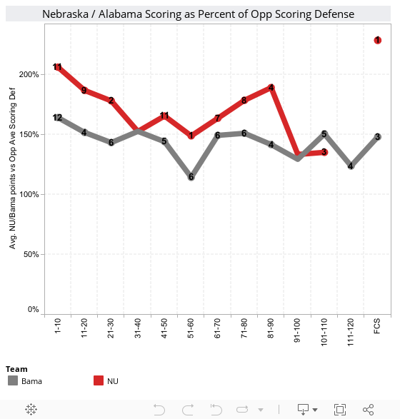
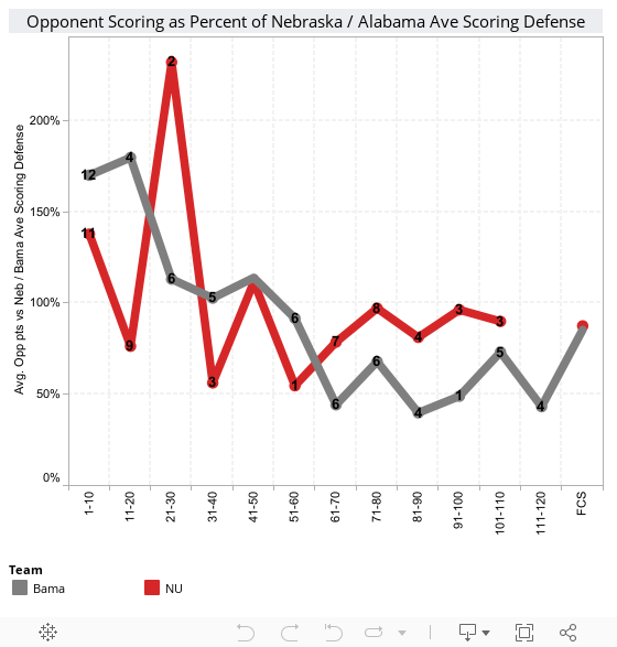
Nebraska’s defensive performance shows no obvious correlation between rank and opponent points. Alabama, shows a strong negative correlation between Opponent rank and the percent of scoring they allowed their opponents. In other words, Alabama held inferior opponents to well under their season scoring offense average but gave up points to highly ranked teams.
For opponents of all ranks, Nebraska’s opponents' average score as a percentage of NU’s scoring defense was 102%. Alabama’s opponents' average score as a percentage of Alabama’s scoring defense was 101%. As with Defense 1, there is insufficient evidence to conclude that one defense is better than the other.
For Alabama , six of their seven losses (86%) were to teams ranked 1-20 (UF-2008-#1, Utah-2008-#4, Auburn-2010-#2, LSU-2011-#2, LSU-2010-#11, and A&M-2012-#5) while two of Nebraska’s three losses (67%) were in the top 20 (FSU-1993-#1, ASU-1996-#4). Alabama and Nebraska both lost to one team ranked 21-30 (South Carolina-2010-#27 and Texas-2006-#25)
Looking at where losses occurred, Alabama lost three at home, two in Bowl/CCGs, and two away. Nebraska lost zero at home, one away, and two in Bowl/CCGs.).
Though it is a subjective assessment, NU's three undefeated seasons, zero home losses, and the same number of bowl and conference championship game losses is sufficient to conclude that NU's win-loss record is better than Alabama's.
 Combined with Nebraska’s better win-loss record, this may present the strongest evidence that Nebraska’s dynasty was more impressive than Alabama’s. It’s hard to ignore that Nebraska's three undefeated seasons were all more difficult than the average of the 10 seasons considered, while Alabama’s were less difficult than the average of the 10 seasons considered. Alabama’s one season more difficult than average was 2010…the season in which it lost three games and finished with a .75 win-loss record. Finally, the most recent two seasons, in which Alabama claimed its back to back National Championships, were the two least difficult seasons considered in this analysis.
I'll allow my readers to make the final conclusions. Who has the best 5-year dynasty?
Intro
There are myriad ways to compare the 5-year dynasties that Nebraska and Alabama have put together. Some indicate Nebraska’s was more impressive, others indicate that Alabama’s was moreso. This is my attempt to compare the two using defensible statistical analysis. It is not the final word on this issue; I’m doing it simply to attempt to get at the question of who accomplished more during their 5-year run.
I organized the analysis along offense, defense, margin of victory, win-loss record, and strength of schedule.
Where I state that there is sufficient evidence to conclude 'X', the statement is based on standard hypothesis testing (t-tests) and evaluated at the alpha=.10 level of significance. The conclusions I draw regarding win/loss records and the overall conclusions are subjective and not based on hypothesis testing.
Where I state that there is sufficient evidence to conclude 'X', the statement is based on standard hypothesis testing (t-tests) and evaluated at the alpha=.10 level of significance. The conclusions I draw regarding win/loss records and the overall conclusions are subjective and not based on hypothesis testing.
Offense 1
This first chart illustrates the average points that Nebraska and Alabama scored when you categorize opponents by end of season ranking. For
simplicity sake, I used the end of season
Congrove Composite Index. Using the end
of season ranking is better because it’s actually available and goes a long way towards to identifying
teams that were ranked at one point in the season but should not have
been or
who were unranked or lower ranked but proved to be better that season.
The number next to each point on the graph is the number of games Nebraska and Alabama played against teams of that rank.
The number next to each point on the graph is the number of games Nebraska and Alabama played against teams of that rank.
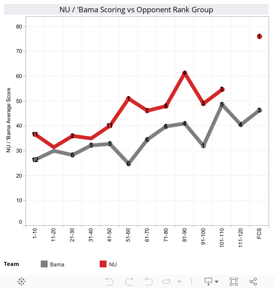
As you would expect, as the opponents’ rank goes down, the
average score that Nebraska and Alabama scored climbs. For opponents of all ranks, Nebraska’s average points scored is
markedly higher. For all ranks, the
average Nebraska score is 42.82 and the average Alabama score is 33.84. There is sufficient evidence to conclude that Nebraska's offense was superior to Alabama's.
Offense 2
This next chart compares Nebraska and Alabama scoring as a percentage of the average scoring allowed by their opponents. While this is much the same as the chart above, it factors in the additional information of their opponent's defenses. Obviously, if Nebraska's average scoring difference came because it played a 5-year slate of defensive duds then the argument that Nebraska scores more points is suspect.
Considering Nebraska and Alabama scoring as a percentage of their
opponents’ scoring defense, one would expect that the percentage would remain
basically steady, or show a slight increase as the rank of an opponent
decreases. This, however, does not seem
to be the case. If anything, there is a slight
negative correlation between percentage scored and opponent rank. It’s difficult to say why this is the case,
but I would speculate that it’s because 150% of an opponent ranked 1-10 is, in
real points, much less than 150% of an opponent ranked 100-110. These games would be the times that 3rd
and 4th string is played, which sometimes leads to offensive
mistakes and ‘garbage time’ points for the opponent.
The flatter trend of the Alabama line may indicate that Alabama as more consistent on offense than Nebraska over the
five years. While they did not put up
the sheer number of points that Nebraska did, their offensive production was remarkably
steady. Nebraska, on the other, was less
consistent, and their performance against teams ranked 101-110 actually
underperformed Alabama’s comparably ranked opponents. This notwithstanding, there is sufficient evidence to conclude that NU's offense was superior to Alabama's.
Margin of Victory
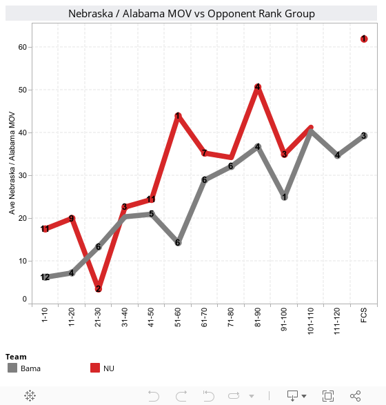
As one would expect, the average margin of victory by Nebraska and Alabama increases as their opponents’ rank decreases. Both show a steady and reasonably linear relationship between average margin of victory and opponent rank. The exception is Nebraska’s average margin of victory against opponent’s ranked 21-30. This is because there are only two games here, and Nebraska lost one of them, leading to a much smaller average.
Generally, we can state that both teams did what great teams as supposed to do…they consistently beat other teams up. As their opponents’ rank decreases, those beatings are more severe. It’s worth noting that Nebraska's average margin of victory against teams ranked 1-10 was 2.5 times that of Alabama’s (17.5 vs 6.3). Against teams ranked 11-20, Nebraska’s average margin of victory as almost three times that of Alabama, (20.0 vs 7.3). For opponents of all ranks, Nebraska’s average margin of victory was 28.2 points and Alabama's was 22.0 points. There is sufficient evidence to conclude that Nebraska had a greater average margin of victory than Alabama.
Defense 1
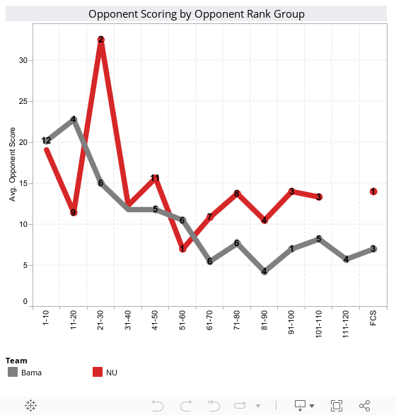
This next chart illustrates a very similar comparison to Offense 1, but it compares the defenses that Nebraska and Alabama put on the field by measuring the average opponent score, again broken down by end of season rank. As above, the numbers on the chart indicate the number of teams Nebraska and Alabama played in that rank group.For teams ranked in the top-10, the difference in scoring defense is small. For Nebraska, it’s 18.2, for Alabama it’s 20.2. For most other opponent rank categories Alabama as a slight performance advantage, ranging from about 3-7 points. For opponents of all ranks, Nebraska's opponents averaged 14.41 points and Alabama’s averaged 11.82 points. There is insufficient evidence to to identify defense as better than the other over the entire five years.
Defense 2
The data points illustrated in the next chart are the average opponents’ score as a percentage of Nebraska and Alabama season scoring defense. A lower percentage indicates a better performance for Nebraska and Alabama .At first blush, I would have expected there to be a negative correlation between the average percentage score by an opponent and the opponent’s rank…better opponents should do better offensively against Nebraska and Alabama than crummy opponents should. Both teams’ opponent scoring shows this general trend, with a decreasing effect as the quality of opponent decreases. This might be explained by the fact that games against far inferior opponents present opportunities to play the 3rd and 4th string, often meaning the opponent has opportunities to score that would not have otherwise been presented had the starters remained in the game.
Nebraska’s defensive performance shows no obvious correlation between rank and opponent points. Alabama, shows a strong negative correlation between Opponent rank and the percent of scoring they allowed their opponents. In other words, Alabama held inferior opponents to well under their season scoring offense average but gave up points to highly ranked teams.
For opponents of all ranks, Nebraska’s opponents' average score as a percentage of NU’s scoring defense was 102%. Alabama’s opponents' average score as a percentage of Alabama’s scoring defense was 101%. As with Defense 1, there is insufficient evidence to conclude that one defense is better than the other.
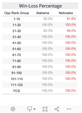
Wins and Losses
This one is simple: Nebraska had a better overall win-loss record (95.2% vs 89.6%) and a much better winning percentage versus top-20 teams (95% vs 83%). Nebraska also had three undefeated seasons while Alabama had one defeated season. Only twice did Nebraska's winning percentage dip to 92% for the season (’93 and ’96). Alabama had four seasons at or below 92% (’08-86%, ’10-75%, and ’11-92%).For Alabama , six of their seven losses (86%) were to teams ranked 1-20 (UF-2008-#1, Utah-2008-#4, Auburn-2010-#2, LSU-2011-#2, LSU-2010-#11, and A&M-2012-#5) while two of Nebraska’s three losses (67%) were in the top 20 (FSU-1993-#1, ASU-1996-#4). Alabama and Nebraska both lost to one team ranked 21-30 (South Carolina-2010-#27 and Texas-2006-#25)
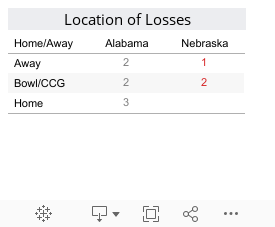
Looking at where losses occurred, Alabama lost three at home, two in Bowl/CCGs, and two away. Nebraska lost zero at home, one away, and two in Bowl/CCGs.).
Though it is a subjective assessment, NU's three undefeated seasons, zero home losses, and the same number of bowl and conference championship game losses is sufficient to conclude that NU's win-loss record is better than Alabama's.
Strength of Schedule
Considering the season average rank of Nebraska’s and Alabama’s opponents, Nebraska’s opponent's five year season average is 48.29 and Alabama’s is 53.82. There is sufficient evidence to conclude that NU’s average season opponent ranking was more difficult than Alabama’s. It follows, therefore, that Nebraska’s dynasty was established during seasons of greater difficulty than Alabama’s.Conclusion
Nebraska was better on offense; neither team demonstrated a clear superiority in defense; and Nebraska had a better win-loss record and a stronger average strength of schedule.I'll allow my readers to make the final conclusions. Who has the best 5-year dynasty?
Monday, March 11, 2013
Army Accessions 1993-2012
I know, it's not college football, but I got a really great data set to work with, and being an Army Officer and all....
Did you ever wonder where all those Soldiers come from?
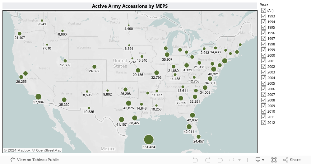
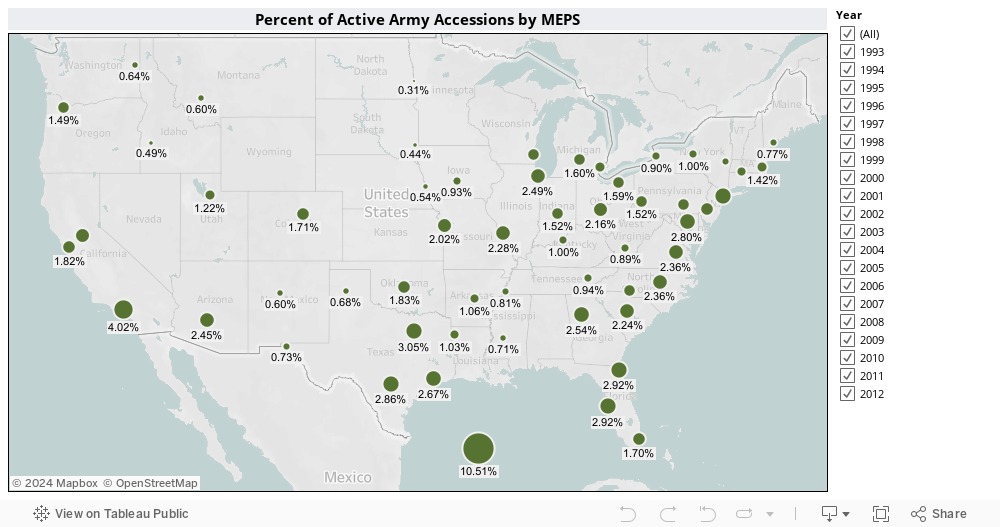
Did you ever wonder where all those Soldiers come from?
Saturday, March 9, 2013
Placing Fumbles in Context (Part 2)
Continuing my breakdown of fumbles, Part 2 looks at fumbles by distance to go, player position, and quarter.
 Looking at the entire football field, the breakdown of fumbles by down and distance looks like this (fumbles on kickoffs and punts are excluded):
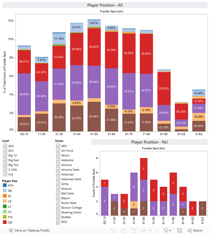
Across the FBS, QB's accounted for about 50% of fumbles in the opponent red zone. The percentage of QB fumbles decreased steadily as the team approached the end zone. Running backs' percentage of fumbles increased steadily as a team approached the end zone. WRs were most likely to fumble in the middle of the field. Interestingly, DBs accounted for a not-insignificant number of fumbles. I suppose this is following interceptions or fumble recoveries.
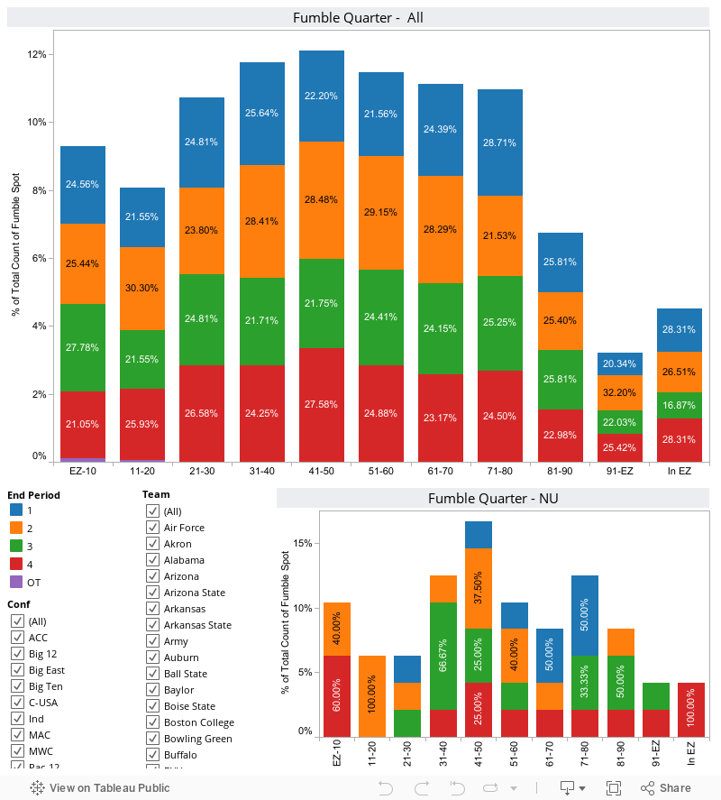
When I look at this chart, absolutely nothing important jumps out at me. While there is some variation in frequency of fumbles between quarters, there's no reason to think that it is due to any reason other than chance.
Tweet
Distance (to go)
 Looking at the entire football field, the breakdown of fumbles by down and distance looks like this (fumbles on kickoffs and punts are excluded):
1st and 10 accounts for the overwhelming majority of fumbles, but it accounts for the lion's share of the down-distance pairings during a game, so there's nothing particularly surprising in that.
For distances of 10 or greater, 12% of fumbles occur on 2nd down, 5% on 3rd down, and less than 1% on 4th down.
For distances of fewer than 10 yards, 2nd down accounts for 21%, 3rd down accounts for 17%, and 4th down accounts for 3% of fumbles.
Because the fumble percentages correspond closely to the actual play distribution by distance to go in a football game I'm led to conclude that distance to go is not a significant contributing factor to the probability of a fumble occurring on a play.
Because the fumble percentages correspond closely to the actual play distribution by distance to go in a football game I'm led to conclude that distance to go is not a significant contributing factor to the probability of a fumble occurring on a play.
Player Position
When I look at this chart, absolutely nothing important jumps out at me. While there is some variation in frequency of fumbles between quarters, there's no reason to think that it is due to any reason other than chance.
Conclusion
And this concludes my breakdown of fumbles. If there's a useful takeaway from Parts 1 and 2, I think it is the improbable frequency of fumbles on punt returns.
Follow @HuskerMathTweet
Thursday, March 7, 2013
What can and can't sports analytics do?
Andrew Sharp at SBNation has a great article called Paralysis by Analysis in which he details his visit, as a confessed analytics skeptic, to the the MIT Sloan Sports Analytics Conference. This conference, to guys like me, is like making the Hajj to Mecca for the world's muslims. It has to be done, but everybody knows its damn expensive, so Allah (or in my case, Nate Silver) understands if it doesn't work out.

It got me thinking, along with a negative comment left by a reader this week, that some folks are misunderstanding what I'm trying to do, and what sports data and statistics analysis can do and can't do.
What can't sports analytics do? It can't predict what's going to happen on the next play, series, inning, snap, or whatever. It can't explain WHY something happened. And it can't take the place of a coach's experience.
What can sports analytics do? It can provide insights into aspects of the game that are not readily apparent to someone watching, coaching, or browsing the box scores. It can serve as an early warning to coaches and managers about potential problem areas and trends before they manifest themselves in the box score (at which time it's probably too late). And it can function as a way to evaluate players and coaches in a (mostly) objective manner.
The negative comment I mentioned above said this:
That piece wasn't about saying "this play will result in a fumble". It was about digging into the limited data available to identify relationships between separate events that might be exploitable. What I found was that fumbles on punt returns occur far more often than they should if they happened at the same frequency as punts. They don't, and that is an exploitable nugget of information. A coach could take that to heart and realize that he needs to place more emphasis (read: time, practice, and coaching) into the act of catching and returning a punt.
Whether the analytics are the low budget work I'm doing or the amazing technology gathering and analysis that companies who went to the Sloan conference are engaging in; we are trying to do the same thing...uncover the hidden information in the game so coaches and players and make better informed decision.
GBR!
Paul
Follow @HuskerMath Tweet
It got me thinking, along with a negative comment left by a reader this week, that some folks are misunderstanding what I'm trying to do, and what sports data and statistics analysis can do and can't do.
What can't sports analytics do? It can't predict what's going to happen on the next play, series, inning, snap, or whatever. It can't explain WHY something happened. And it can't take the place of a coach's experience.
What can sports analytics do? It can provide insights into aspects of the game that are not readily apparent to someone watching, coaching, or browsing the box scores. It can serve as an early warning to coaches and managers about potential problem areas and trends before they manifest themselves in the box score (at which time it's probably too late). And it can function as a way to evaluate players and coaches in a (mostly) objective manner.
The negative comment I mentioned above said this:
After all of that it means really nothing...You still cannot prevent these kind of mistakes, and you surely will never be able to look at these graphs and charts, and decide before the next play "the fumbles a coming, better tell so and so to hang on to the ball".....Pretty much a big ole waste of time.....The comment was directed at the first part of a two-part piece on fumbles that I wrote earlier this week. I appreciate the commenter's feedback, but I think he's missing the point. Or maybe I failed to help him understand the point.
That piece wasn't about saying "this play will result in a fumble". It was about digging into the limited data available to identify relationships between separate events that might be exploitable. What I found was that fumbles on punt returns occur far more often than they should if they happened at the same frequency as punts. They don't, and that is an exploitable nugget of information. A coach could take that to heart and realize that he needs to place more emphasis (read: time, practice, and coaching) into the act of catching and returning a punt.
Whether the analytics are the low budget work I'm doing or the amazing technology gathering and analysis that companies who went to the Sloan conference are engaging in; we are trying to do the same thing...uncover the hidden information in the game so coaches and players and make better informed decision.
GBR!
Paul
Follow @HuskerMath Tweet
Wednesday, March 6, 2013
The Heat is on
 This is a heat map of all FBS seasons from 2002-2012. A team's average PF are on the Y-axis and average PA are on the X-axis. The average power ranking by Jeff Howell is the value. It sort of illustrates that if you score a lot of points and your opponents don't you will be highly ranked.
I marked where NU 2012 ended up.
So simple, yet so hard.
Follow @HuskerMath Tweet
Does NU fit the profile of elite-win teams?
Ask any true Nebraska fan and he or she should be able to
tell you, almost reflexively, how many win Tom Osborn always had. “9” is a magical number to Cornhusker fans,
and has become the de facto minimum standard of what Husker Nation will
tolerate.
Tom Osborne, however, played more than 12 games per season
only 6 times, and those were 13 game seasons.
He averaged 12.24 games per season over his career. Bo Pelini has played 3 14-game seasons and 2
13-game seasons for an average of 13.6 games per season.
Should that extra game and ½ mean that the minimum standard
should be raised? Is a 9-win season no
longer the impressive feat that it was under Tom Osborne? Both are subjective questions outside the
scope of analysis based on statistics.
What is within that scope, however, is a look at where Nebraska is in
relation to other 9, 10, 11, and 12 win teams.
With that in mind it might help frame the issue of whether Nebraskans
want to hold Coach Pelini to a 10- or 11-win standard.
To do this I took all teams with 9 or greater wins from
2002-2012 and calculated the average PF and average PA for 9-, 10-, 11-, and
12- win teams. There weren’t enough 13-
and 14-win teams to draw statistical inferences from. Using that info, I broke the teams into conference
averages as well.
I’ll skip the rest of the nerdy stuff and get right to the
point.
Finding 1:
Offensively, (particularly as a member of the B1G) Nebraska is well
positioned to move into the realms of 10-11
win teams. The 2012 Huskers performed at
an offensive level that is well above the average for 9 and 10 win teams,
slightly above average for 11-win teams, and right at average for 12-win B1G
teams. Despite NU’s turnover problems
they scored a lot of points.

Finding 2: Nebraska’s
defensive performance this year is well-below average for even 9-win teams over
the last decade. For B1G teams, it is
even worse. Nebraska’s PA this year
would be in the bottom 10% of 10 win teams, the bottom 5% of 9 and 12-win
teams, and dead last for 11-win B1G teams.
The conclusion is clear: Offensively, Nebraska matches the profile of elite win teams. Defensively, Nebraska's performance does not merit consideration as an elite win team and will almost certainly preclude it from becoming one if it does not improve. Bo Pelini’s emphasis needs to be
on the defense next year.
Follow @HuskerMath
Tweet
Follow @HuskerMath
Subscribe to:
Posts (Atom)